Introduction to Banking Application Form UI Design

We design banking application forms to support accuracy, trust, compliance, and efficiency. Every interaction within a banking form—whether opening an account, transferring funds, or updating personal information—must balance usability with regulatory rigor. The choice and implementation of UI elements directly affect conversion rates, error reduction, and customer confidence. This article presents a comprehensive, structured overview of the types of UI elements used in banking application forms, focusing on clarity, accessibility, and security.

Title

Text Input Fields

Single-Line Text Fields

Single-line text fields are foundational UI elements in banking forms. We use them for names, account numbers, usernames, reference notes, and short identifiers. These fields require clear labeling, placeholder guidance, and strict formatting rules to prevent data entry errors.

Best practices include:

  • Persistent labels instead of disappearing placeholders
  • Character limits aligned with backend constraints
  • Real-time formatting for account or routing numbers

Multi-Line Text Areas

Multi-line text areas support optional descriptions, transfer memos, dispute explanations, and customer messages. We clearly mark these fields as optional to reduce friction and guide users on acceptable content length.


Title

Numeric and Currency Fields

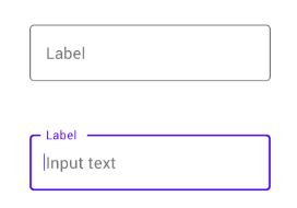
Numeric Input Fields

Numeric fields are critical for amounts, quantities, and identification numbers. We restrict input to numerical characters and enforce precision rules that match financial system requirements.

Currency Fields

Currency fields extend numeric inputs with currency symbols, decimal precision, and locale-aware formatting. In banking applications, these fields must handle:

  • Thousands separators
  • Fixed decimal places
  • Real-time validation against balance limits

Clear visual formatting reduces cognitive load and prevents transaction errors.


Dropdowns and Selection Controls

Dropdown Menus

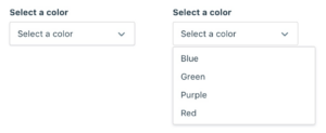
Dropdown menus are widely used for account selection, frequency options, payment types, and country lists. In banking forms, we design dropdowns to handle both small and large datasets efficiently.

Effective dropdown design includes:

  • Searchable dropdowns for long lists
  • Clear default states
  • Disabled options for ineligible selections

Radio Buttons

Radio buttons support single-choice decisions, such as selecting a transfer speed or confirming account ownership. We display all options visibly to promote informed decision-making.

Checkboxes

Checkboxes enable multiple selections or acknowledgments, commonly used for terms acceptance, optional services, or notification preferences. We pair them with concise explanatory text to meet compliance requirements.


Date and Time Selection Elements
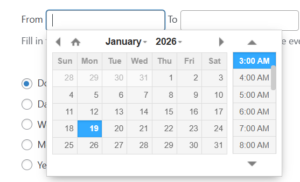
Date Pickers

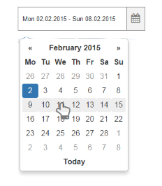
Date pickers are essential for scheduled payments, recurring transfers, and statement periods. We constrain selectable dates based on business rules, such as non-processing days or future-only scheduling.

Time Pickers

When time specificity is required—such as cutoff times or appointment scheduling—time pickers provide structured input and prevent formatting errors.


Frequency and Recurrence Controls

Frequency Dropdowns

Banking applications often include frequency controls for one-time, daily, weekly, or monthly transactions. We present these options in simple dropdowns paired with conditional logic that reveals additional fields only when needed.

Recurring Schedule Builders

Advanced forms may include recurrence builders that combine frequency, start date, end date, and execution rules. These components require clear visual hierarchy and inline explanations.


Validation and Feedback Elements

Inline Validation Messages

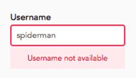
Inline validation messages provide immediate feedback for format errors, missing information, or invalid values. In banking forms, we display these messages clearly without disrupting user flow.

Helper Text and Tooltips

Helper text and tooltips clarify complex financial terminology, regulatory disclosures, or input expectations. We ensure these elements are concise and accessible, especially on mobile devices.


Action and Navigation Elements

Primary Action Buttons

Primary buttons such as Submit, Continue, Review, and Confirm drive form progression. We visually distinguish them to guide users through critical financial actions.

Secondary and Tertiary Buttons

Secondary actions like Cancel, Save for Later, or Back provide control without competing with primary objectives. Proper hierarchy prevents accidental abandonment of sensitive processes.


Review and Confirmation Components

Summary Panels

Before submission, banking forms often present read-only summary panels that allow users to review entered information. These panels reduce post-submission errors and support informed consent.

Confirmation Checkpoints

Confirmation checkpoints require explicit acknowledgment before executing high-risk actions, such as fund transfers or account changes. We use clear language and visual emphasis to reinforce finality.


Security and Authentication UI Elements

Masked Input Fields

Masked fields protect sensitive data such as PINs, passwords, and security codes. We allow temporary reveal options to reduce input mistakes without compromising security.

One-Time Passcode (OTP) Fields

OTP fields support multi-factor authentication during critical form submissions. These fields are optimized for quick entry and error tolerance.


Accessibility and Compliance Elements

Accessible Labels and ARIA Support

All banking form UI elements must support screen readers, keyboard navigation, and assistive technologies. We ensure semantic labeling and proper ARIA attributes across all components.

Consent and Disclosure Sections

Regulatory compliance requires clear presentation of terms, disclosures, and privacy notices. We structure these sections with expandable content and explicit consent controls.


Progress Indicators and Form Flow Controls

Progress Bars

Multi-step banking forms benefit from progress indicators that show completion status and remaining steps. These elements reduce abandonment by setting clear expectations.

Step Navigation Controls

Step-based navigation allows users to move forward and backward without data loss, supporting complex processes like loan applications or account onboarding.


Conclusion

We design banking application forms with precision, clarity, and trust at the core. Each UI element—from text fields to authentication controls—plays a critical role in ensuring secure, compliant, and user-centered financial interactions. By thoughtfully applying these UI components, we create forms that reduce errors, improve completion rates, and reinforce confidence in digital banking experiences.